Thursday, 2 January 2020

M3 - Codes and Conventions


CONVENTIONS
The typical conventions for all indie/rock music videos are as following:

Performance:
  1. Typical for a live performance of the band or artist to be present.
  2. About the passion of music rather than the success of the artists.
  3. If the video is a narrative, elements of performance are added in throughout.
Narrative:
  1. Narratives are used to tell a story by using sequences of clips, matching the lyrics of the song to help the audience along, linking to Goodwin's theory of illustration.
  2. They keep your attention as what is on screen is constantly changing so the audience is constantly entertained. 
  3. Leaves a lot to the imagination, for the audience to discover for themselves. 
Mise en scene:
  1. Mise en scene plays a big role as it helps the music videos have their own iconography, traits and overall look. This is the reason why most indie/rock videos look so contrasting to one another.
  2. Make-up, props and costumes are also major components as they help indicate the themes further, as well as the era they're meant to be in. 
  3. Clothing is normally with many layers.
Sound:
  1. Other sounds before the music video actually starts.
  2. Effects to the sounds (distortion, echo, fade).
Camera: 

  1. Full-length shots are normally used, along with wides and prolonged stills of individual objects or characters to establish them from the beginning. Normally to show clothing or surroundings, helping with characterisation. 
  2. Establishing shots and location are primarily one of the first shots you see in these types of music videos. 
  3. Different angles are constantly switched between. 
  4. Extreme close-ups are used to get the idea of the feelings of a character and interpret inner emotions. 
Editing:
  1. Old fashioned, dry, vibrant colour scheme. Meaning that filters are used commonly to give the videos a sense of another time. Special effects are added to sometimes make the video more exciting and memorable. 
  2. Fast and slow cuts between the shots often reflect the pace of the music, creating either quick or slow atmosphere and pacing. 
  3. Videotape filters are used regularly as well as ones that look like an old TV, creating voyeurism. 

The typical indie genre conventions tend to be out in the open in nature with easy-access, low budget locations. The normal colours are quite natural to match with striking colours on certain items or clothing. As with Mumford and Son's videos, these bright colours from a darkened background are quite prominently presented.

Because of this, we chose to enhance the colour saturation and exposure of the scarf and coat, making the outside area less colourful so the eye would be drawn more to the character.

Our music video
We used lots of important iconographies of the bunny rabbit throughout, showing (via mise-en-scene) a slow development, portraying a lot of emotions, despite it being a mask and not showing any different facial expressions, by body language. The character is really expressive and over-the-top.

Mumford and Sons
We made sure to include some elements of performance, even though it wasn't our main aim, as it is a very large aspect of the indie/rock genres.

Additionally, the composition of the shots in our music videos are on the cross points of the third lines to make the composition stronger at every point and every shot composition. We used lead-in-lines to direct gaze of the audience/viewer towards the most prominent parts of the shot, which are mostly the character.

my favourite shot
Another thing we tried to do was to play with shadows and darkness, taking conventions from the rock music videos (as they have darker themes and are often shrouded in darkness). Darkness and lack of light is obvious in many of our shots (the alleyways, the tunnel, the graveyard). 


As many other indie/rock music videos show slow or fast tilts from an object to another object or the sky, we decided to do the same to keep it firmly within this genre. I looked previously at 'Hopeless Wanderer' by Mumford and Sons which shows a similar transition (examples below).

-------


---------

The shot types used throughout our video are also conventions of the indie/rock genre because we kept it at wide shots and close-ups, flicking between wider shots and getting gradually closer as time goes on. We used low and high angles frequently due to the genre conventions of this genre.

----
PURPOSE 
As the purpose of the music video is to entertain and promote the artist, hopefully getting them much more recognition, we kept that in mind when creating strong iconography with the rabbit character which people might be able to associate with Plicketts Mahoo going into the future. 

ENTERTAINMENT VALUE 
'I thought it was creative and unique. It was entertaining because I was constantly gripped by the strange, alien visuals and haunting song.' - Benjamin Perry

Because of this review from a peer, we know it was a success as a music video as it was entertaining to an audience. When we showed this video to the artist himself, he was very pleased with the overall result as he felt it showed his message well. 

THE ARTIST

SYMBOLISM

Rabbits can represent:
  • Innocence, naivety and childlike curiosity. The white rabbit from The Adventures of Alice in Wonderland (Lewis Carroll) embodies a lot of this as the titular character, Alice, follows him. He may represent her curiosity and is now well known and recognised in pop culture.
  • In some circles, rabbits may be seen as lucky creatures or a symbol of good fortune. The white of the rabbit we're representing in the video links to purity - perhaps perfection to a degree that's slightly eerie.
  • Rabbits are also associated with spring, Easter and fertility. This could link to the idea of rebirth, new life or vitality. 
  • Childishness. This rabbit could represent a child dealing with loss.


Buster from the cartoon 'Arthur and Friends' is a character made to be appealing to children. He's made up of rounded, unthreatening shapes and this plays into the childish innocence of the rabbit archetype in the media at large.

This Covergirl fashion magazine cover plays into the cuteness and innocence of the rabbit - it emphasises the aspect of femininity or fertility we see sometimes in the representation of rabbits in media. It also plays with the perfect and pure image they project, perhaps a hint at the nature of makeup advertisement - typically, it pushes people to aspire for perfection.

This typical Beatrix Potter sort of scene with rabbits takes us away from the white, pure image of rabbits to more of a maternal, domestic vision. It plays on the fertility and innocence of rabbits by, again, anthropomorphising them and giving them human values.


This is a different kind of advertising, aimed at parents and children. It's bright, the bunny is active and lively, and the company would like to appeal to people in an innocent way.

As I've mentioned, the White Rabbit from Alice In Wonderland is very widespread as a character. They're meant to be a little unsettling in this particular image, contributing to the overall eeriness or oddness of the story.

The were-rabbit from Wallace and Gromit plays on the age-old contrast between innocence and violence. Rabbits are expected to be small and silly, which adds to the element of comedy.


As our music video doesn't have much iconography, this could itself be iconography as it goes against conventions of our genre. If you consider the rabbit character iconography, then it could represent innocence and discovery, maybe starting a new chapter in your life after something majorly changing it.

This in a way symbolises the artist. They're new and undiscovered so hopefully, anyone who relates to the song would relate with the artist and seek them out as they agree with the themes and meanings. In the end, there are credits which show the artist and the name of the song. The spiky text represents the artist as well and could differentiate them between other artists as it's not just any normal font.

Nature could symbolise the basics of everything, it's where everything starts, everything originates. Nature strips everything back. In our video, it shows the character resorting back to the start. Nature could be the only thing not ruined in their life. Nature is all the animals, plants, and other things in the world that are not made by people, and all the events and processes that are not caused by people.


We chose to film locked off wide shots that allowed us to establish the environment, but also we later created effective jump cut sequences to show the passage of time and that they are trapped (not being able to move on), this works very well as all the shots were filmed from static. 


We used a lot of symmetry in the subway also to make it more striking as a composition along with the colours, it stands out and will hopefully be remembered. It represents balance and steadiness. It also has connotations of flowers, they normally look the same, showing a sort of regularity.

Rule of thirds was another technique we used. It allows the shots to look more even and dynamic, centring the character majorly on the lines as they move around, meaning that the rabbit character is always the focus of the video; the audience's eyes are drawn to it throughout.


P5 - Editing Techniques

To begin with, I created a new project on Final Cut Pro by firstly creating a new Event so all my work was collectively in one place to avoid complications and delays later on in production (file, new, event), naming it music video. Then I created a project 'Claws' and imported all the files I needed by directly inserting my 64GB SD card into it. I used Image Capture and created a separate file on my Desktop which I also named 'Claws' so my files were easily accessible.


-
The first version was created before we had all of our footage, as we had only completed one filming day and therefore didn't have either the Church scenario, the tunnel segment or the Artist shots. I worked with the footage, attempting to fit it with the storyboard which Ellie drew. As you can see from the 'first assembly' above, I used the Final Cut placeholders in place of the church to remind that there was footage I was missing to return to later.

I attempted to insert an overlay of the shots by making the eyes 65% transparent over a still of the trees but, after receiving feedback from the rest of my group, I changed it.

In the first edit, I made the decision to only include basic cuts as we weren't yet sure of the transitions that were possible so it does, in retrospect look very amateur and clumsy. Also, with the footage we had, our first edit could only be up to 1:29.


As we progressed with another day of filming, we were able to require the footage from the Church and the trees (which were near the church), so I was able to remove the placeholders and replace it with the actual footage that was in the storyboard.

However, I discovered that the tree footage was very shaky, meaning I had to put on 'Stabilisation' and slow it down to make it only look like it was only moving with slow wind and to give it a more celestial and other-worldly feel. Another thing I did was to turn down the overall exposure of the Church shot as it was much lighter than expected when we finally viewed it on FCP.


In this edit, the eyes section is removed as the rest of my group didn't like it and we made the decision to try something else instead. To fill this now-empty space, we used one of our reserve shots of the bunny looking menacingly into the camera and began thinking about the overall colour correction as it looked very unstylish still. We timed this one for the entire duration of the song so we were aware of the overall length, hence why there is a minute and a half of black screen.

In place of the artist footage, I used another placeholder, with a text effect put over it to show the lyrics the artist needed to play too.


We set this version to our peer and they handed us a list of changes they wanted us to include. I strayed a little from the storyboard (not having the character touch the camera earlier) and the whole jumpcut segment, but looking back on it, I didn't think settling on the storyboard would be possible.

At this point, I had all my shots so I worked thoroughly with the shooting script, trying to interpret it the best I could. 


To make our video seem a little more varied, I made the decision to have fade transitions from the leaf to the graveyard, and to the credits, which I implemented with the FCP text tool.


The feedback I received was:

'You have all created a really strong concept video with impressive visual strength. Really striking, well done!'

'Some lovely pacing and the visuals complement the music well in terms of edit points and visual changes.'
  1. 'My first instinct is that the overall feel of the video would benefit from every shot having a slight slow-motion effect to emphasise the “otherworldly” feel. I would suggest only slowing the footage down by 95%. This change should not affect the edit points, just the speed of the footage.
  2. The footage would benefit from a purposeful colour grade to balance it and add coherence and enhance the stylized look to complement the concept.
  3. 0:16 visual change needed
  4. 00:23 beautiful walking away shot is it possible to introduce jump cuts here to echo what we see later in the video.
  5. 00:32 whisper shot and tilt-up is fabulous!!!
  6. 00:45 love this shot!
  7. 01:03  camcorder graphic fx needed
  8. 01:12 check if natural sound accidentally still audible
  9. 01:14 love this cut
  10. 01:20 check if the natural sound of water is accidentally still audible
  11. 01:24 water/stream shot - consider a really slow gentle zoom in to focus audience attention.
  12. 01:50 my favourite shot.


We acted on this feedback!
Starting on the first bullet point, we worked through the list, 


  • I slowed down all the clips initially (selecting all of them), and going on the 'duration' tool, custom... then setting it to 95%, changing the speed of each clip, without changing the duration. 


  • We chose a certain colour grade percentage for exposure for all of our shots so they all looked roughly the same. I created a colour shape mask around the coat and scarf, to make them stand out and to look brighter as they were one of the steady motifs I decided on. 
 
  • To track these masks through the shot, I used control points and effectively animated each of them. 
  • I added in the jump cuts with the walking away effect.
  • Looking on FCP, I used the camcorder overlay to make an effect here and to also make another running through motif. 
  • 1:12, the audio wasn't audible.
  • I created a compound clip of the water to be able to do a zoom in.


Over the entire video, I put a cartoon effect to make it very stylistic, I think this gives it flair and individuality.


With this feedback, most of it was unable to be accomplished due FCP not being able to do the 12fps frame rate, the roto effect being 100% and not being sensitive enough to pick up all parts of the video. 
If we had more money, another suggestion he gave was to hand-animate the leaf over to make to a more prominent feature. Unfortunately, we didn't have the time or money. 

OUR FINAL PRODUCT 

P4 - Camera Setup

P4 - CAMERA SETUP


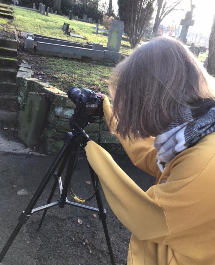
We used a Nikon D3400 DSLR Camera to shoot the footage. Our backup was a Sony Bridge Camera, but we didn't end up using it.

Along with both of the cameras, we had up to three spare batteries for each, fully charged so we could maximise our time, without having to return to charge up our cameras. From prior experience, we learnt to bring more than one SD card in case one got lost or didn't work at the time. Luckily, the SD card we ended up using, a 64GB, worked for the full duration for the shoot so it wasn't needed.

We used automatic ISO to adjust appropriately to lighting changes most of the time, however, this was adjusted when we moved locations from the graveyard (early morning), to the church (late afternoon) as the lighting was different. For the church, we used a wider aperture with an iso of 800 whereas, for the graveyard, we used a smaller aperture (dof of 5.6-6.4) and an iso of 200.

We did use manual focus and attempted focus shifts on such shots as the whispering one. We decided manual focus would be best as then we would have more control over what the shots would look like and worked better when working on a tri-pod, which we did. 

How we organised our raw footage!
I sorted them into folders by suitability and use, classing them on where the footage was shot or where in the whole process it belonged. I changed the folder destinations as we went along so make it easier for myself and the rest of the group!


M4 - Final music video meets client brief

While filming, we were conscious of Andrew Goodwin's theory about music videos, so there were, in the edit, moments where the lyrics and visuals matched up completely. Also the use of mise-en-scene with the rabbit character and the iconography of no iconography, mentioned in our D1. His theory says that there is a purpose for music videos- and ours was to promote our artist and give them rightful notoriety. Most of the shots matched up with the lyrics sung such as the clock part right at the beginning, which is one of the concepts presented by Goodwin (mise-en-scene and links between the music and visuals).

Our music video promoted the artist by using their music and the end card, at the end of the music video. We also published the music video on the creator's channel and promoted them on Twitter. 

ARTIST'S FEEDBACK
"I'm happy to have people listen to my music and find meaning in what I do. It surpassed expectations."

The artist was very happy with our music video. 


So, did we meet the brief? 


This was the brief we were given. 

We created a concept video with live-action video, it runs for the entire length of the song with a few seconds afterwards as well for the credits. The brief shows that we need to have created a video for an established artist or local band, we chose a local band which fits with the brief. We believe it is appropriate for the target audience as it obeys mostly all conventions of the genre, purposefully subverting some of them to create intrigue, this is explained more thoroughly in our M3 [click here to see our M3]

We worked in a group of 3, which was also in the brief as the maximum people allowed in the group, (hazel, ellie and natasha). I took on the editing role, natasha was the cinematographer and ellie was the director. As the brief specifies, we each had our own individual roles within production, as you can see here and here.

All content we made ourselves, they are all therefore from a copyright-free source, fitting with the brief as you can see below.


You can see our production documents along the righthand side of our blogs.

Our final video uses the entire music track for Claws
with time to spare - we made sure we had ample shots
to cover this.

Our video definitely fits the bizarre, otherworldly
the tone that some of the others in the genre met (ie.
Mr. Brightside by The Killers), however it isn't
monochromatic like we had planned. We did
tone down the saturation of each colour, instead
upping the blue of the coat and the red of the scarf for interesting pops of colour.
As for iconography, we did end up with some mystery shrouding the identity of the artist and, due to a slight change, we only got shots of his hands.
I think we've very clearly reflected the song's lyrics in a visual format, and at points enhanced them rather than blatantly illustrated them for the viewer.

The typical indie genre conventions tend to be out in the open in nature with easy-access, low budget locations. Our budget was 0 so we were forced to go along with this regardless. As full-length shots are normally used, along with wides and prolonged stills of individual objects or characters to establish them from the beginning, we immediately introduced the rabbit character after setting the scenes and tone of the video with a slow zoom in on a clock from a wide shot. We established a motif of very bright colours on the clothing and unsaturation of surroundings to demonstrate a contrast between the two. We tried to play with shadows and darkness, taking conventions from the rock music videos (as they have darker themes and are often shrouded in darkness). Darkness and lack of light is obvious in many of our shots (the alleyways, the tunnel, the graveyard). 

FILE EXPORTS


I created a new project and made it suitable for the country we are in, along with a resolution that would allow the video to be shown on tv (1080p, apple proress 422). The frame rate had to be 25p as that is the standard for all European countries and we are in Europe.


We exported a lower quality version to be  compatible with YouTube by following these steps:

  1. FILE > SHARE > MASTER FILE
  2. Amend SETTINGS
  3. Choose H.264
  4. Save the master file in your Music Video folder on the DESKTOP and call it Claws H264 version.


H.264 is a type of video compression commonly exporting and distributing high-resolution video.  H.264 is a lossy file which means that when it is compressed (made into an h.264 file), some of the data is lost in the process, making it look a little laggy and fuzzy sometimes. The files are still high quality but have bits missing from them.


This is our 2.19GB video export.
These were the steps we followed:
  1. FILE > NEW > PROJECT
  2. We chose 1920x1080 resolution 
  3. Set it to 25 frames per second to be compliant with UK/EUROPEAN television HD broadcast standards. 
  4. Apple Pro Res
  5. The music is Stereo at 48kHz as this is broadcast standard.
It ensures image loss is restricted and the detail of the video remains. It can export in full 8K, 4KHD (up to 1920×1080), many others I may have missed off. Apple ProRess 422 discards pixels from the video, making it look much less obvious than an h.264 export while still remaining to be a lossy export.

P4 - Logging Rushes

P4 - RUSHES

UNUSED SHOTS


This shot ended up being blurry because we didn't pull focus correctly. To resolve this, we readjusted the focus and tried again.


This was our first attempt at an over-the-shoulder shot - it ended up being very shaky because I was carrying the camera on the wrong shoulder. We tried again afterwards and went more quickly in order to make the footage less shaky and awkward.


This shot was too jerky and shaky, we had to re-record it.


EFFECTIVE SHOTS


This shot was a good one - it goes on for quite a bit, meaning that we had enough footage to cut together effectively.

P3 - Permission to film

PERMISSION TO FILM / PRIVATE LAND

This is our permission to film that has been submitted to the Bradford film office in which we filled in our Public Liability Insurance and risk assessment form along with an entire description for the purpose of our filming. Nothing should be an issue though.

..........................................................................................................

Filming Enquiry
Your Details
Name: Hazel Potter, Eleanor Payne, Natasha Greenwood
Email: dreamscapeproductionsmedia@gmail.com
Phone: 07472629879
Job Title: Student
Company Name: Ilkley Grammar School
Production Details
Production Name: Claws
Production Type: Music Video
If Other: 
Production Description/ Synopsis: We are filming in a graveyard to capture the concept of loss as it is
a topic very close to all of us due to very recent events. Don't worry,
this shouldn't take too long, only around 2 hours.
The synopsis is; a person followed through their emotional journey
of self-discovery around others and the environment, they want to
protect.
Where will it be Broadcasted: This is non-commercial but will be on YouTube as this is easiest
way to submit the final product for our A-levels.
Filming Locations
Filming Location: Burley Cemetery
Start Date: 30/11/2019
End Date: 07/12/2019
Number of Days: 7
Other Filming Locations: Burley Wier.
Section
Number of Crew: 3
Number of Actors and Secondary Actors: 1
Drone: No
Upload your CAA certificate: 
Type of Equipment: Tripod, Camera x2, handheld lighting eg phone torches.
Description of Filming: We will be filming majorly close-up and mid shots from very flat
landscapes to minimise safety hazards. There is only one actor so
no large space is needed and we have made sure to arrange it with
minimal disruption.
Other Information
Filming Involves: 
Services Needed
Services: 
Vehicles
Number of Vehicles: 
Registrations: 
Forms
Risk Assessment: http://www.bradfordfilmoffice.com/wp-content/uploads/2019/11/Film-Production-Risk-Assessment.pdf
Have you uploaded a Risk Assessment: Yes
Public Liability: http://www.bradfordfilmoffice.com/wp-content/uploads/2019/11/RPA-119821.pdf
Have you uploaded a Public Liability: Yes
Other Enquiries

Do you have any other Enquiries: 


Wednesday, 18 December 2019

P4 - PRODUCTION LOG

written by Eleanor Payne 


SATURDAY 30TH NOVEMBER


FILMING

On Saturday, we began filming our rushes in the Burley Graveyard. We used Natasha's camera, Hazel's SD card and the rabbit mask we bought. Hazel was today's rabbit and so she wore simple black with a large coat and scarf. If we needed, I could also be the rabbit - I wore black under my jumper, just in case we needed another person to act. We're both quite lanky so we could pass off as the same rabbit.

We first got some nice silhouette shots of the rabbit stood across from a grave. It was a Christian cross headstone so we had to bear in mind religious representation and respect. Setting up the camera on the tripod was relatively easy and we got the shots in good time. The things we had to bear in mind whilst filming were:

  • The golden ratio and rule of thirds
  • Focus and zoom
  • Lighting and white balance
From today's filming, we've learnt that our strength was efficiency and getting the shots we needed in the time we had. We worked from the storyboard and crossed each panel off that we filmed.
Next time we film, we could perhaps focus more on the golden ratio and composition of our shots, and in addition the delicacy of each (getting the zoom, angle and focus exactly correct). We'll have more time next Saturday to film the rest of what we need but I think we've made great headway.

The only issue we had was the cold, but we had a blanket to keep us warm as we were prepared, as Ellie demonstrates (in the photo on the left).


CLAWS - BEHIND THE SCENES

TUESDAY 3RD DECEMBER

EDITING

Today was our first day of editing - we had the shots from the graveyard to work with. We managed to get a lot of extra footage to fall back on. Hazel, our editor, had control of the mac but Natasha and I chipped in with suggestions and reminders, referring back to our initial storyboard. We stuck fairly closely to the panels so it wasn't difficult to get them in order and add placeholders for the footage we don't have yet.


This is the first assembly of the video we finished today - it shows our progress up until this point:


Natasha and Hazel filmed some more after school - next time we edit, we can now replace our placeholder images.

WEDNESDAY 4TH DECEMBER

EDITING

We continued with the editing process, adding in the footage Natasha and Hazel filmed the other day.


We had another look at the order things were in and decided to move some footage about. We started to think about lining everything up with the music as well as the storyboard we had filmed with.

One particular focus of today was the colour correction and the stabilisation of each shot. Hazel went through them and we all decided what looked best, bearing in mind the conventions of the indie genre.


"Keyframes are an absolute nightmare" - Hazel Potter

SATURDAY 7TH DECEMBER

FILMING

We spent today filming the rest of the rushes for the video. Previously, we had crossed off the parts of the storyboard that we'd filmed in the graveyard and so it was clear what we needed today. As the Rabbit, Hazel needed to act in front of the camera. Natasha was the cinematographer and primary camera operator, and so needed to be behind it to line up each shot. In the director's role, I made sure each shot looked good and made sure we were sticking to the storyboard.

We first filmed in the underpass in Burley - it was tinged a very warm yellow, which we've since realised in editing it, and is something to watch out for and keep in mind in future with choosing locations. It had interesting leading lines which make for a good composition and we definitely made use of it. The one obstruction we repeatedly came across were the dog walkers that came past and through the tunnel. We had to wait a while at times for people and their pets to pass.

After this, we filmed along the river. We had to watch out for slippery mud, certainly with Hazel's obscured vision with the mask, and also for people's properties - it was unclear what land we were allowed to be on and so we had to take care not to trespass.


We then had to finish the filming day by going over our documents and ensuring we had every shot.


MONDAY 9TH DECEMBER

EDITING

Today, we were tasked with adding the newest rushes into our video. Hazel put them into order and we worked as a group to get things in order, according to the storyboard and also what looked best. There were a couple of things we had to change or take creative liberties with, but other than that it turned out very similar.


MONDAY 16TH DECEMBER

EDITING

We set out to tie up any loose ends and add more interest to the final cut. This involved adding a vignette filter to darken edges and highlight focal points. We also added the cartoon filter, which softened the shots and made the video look otherworldly and ethereal, and slowed the clips down by 5%. The last thing we did then was to colour grade it - we tinted the video blue.